BRAND BOYS
WAREHOUSING & DISTRIBUTION
IDENTITY & WEBSITE
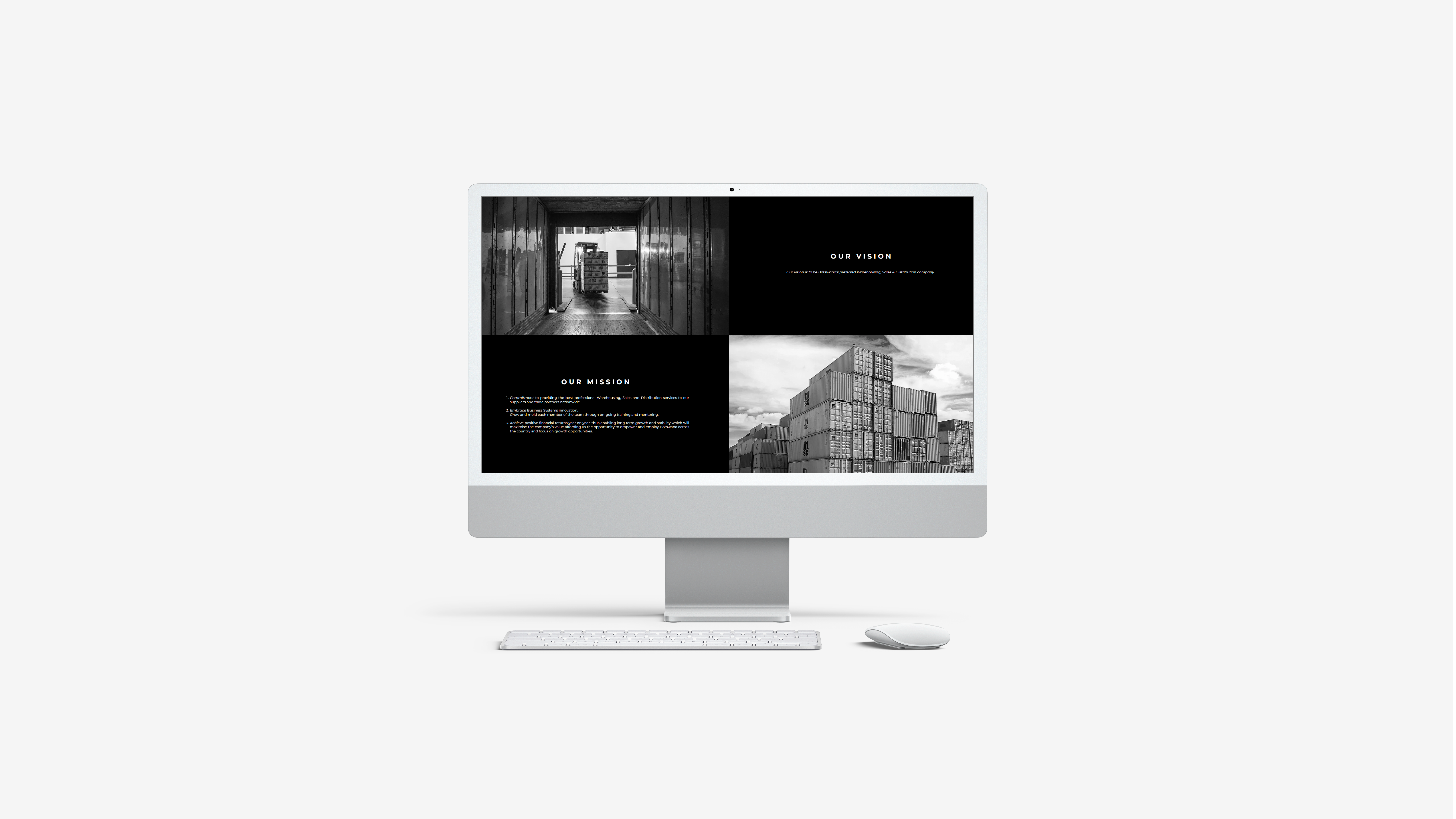
Brand Boys is an established warehousing, distribution, and sales services, provider. Brand Boys desired a new identity and website that would inform prospective clients about what they have to offer in a simple and professional way. Working with international brands, they needed a look and feel that would put them on equal footing with the brands they provide services for.
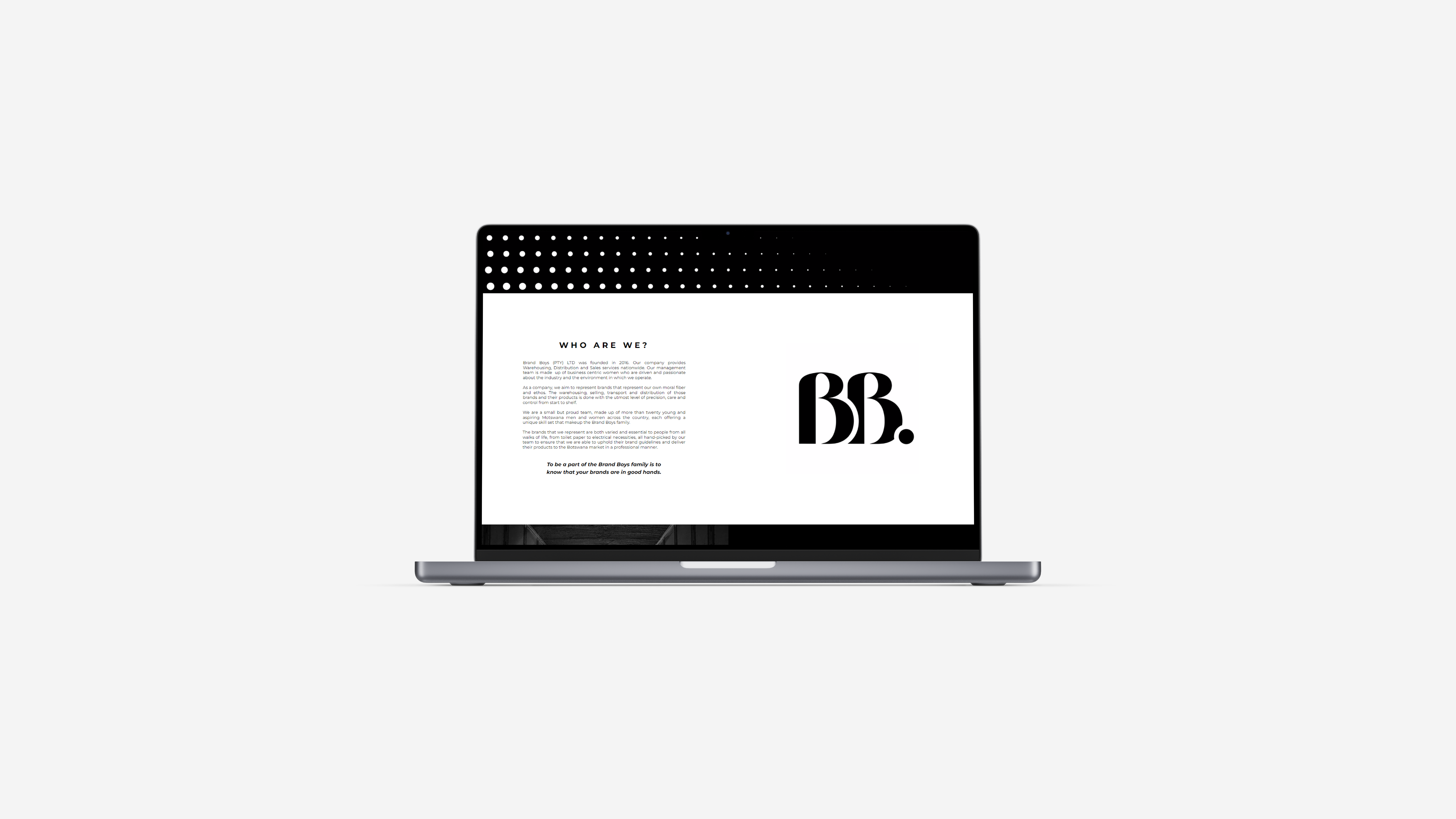
Collaborating with an animator, who brought in movement, I designed a logo and logo mark that is clean, sophisticated, yet simple. The unusual name was tricky to draw from, so I chose to make it sleek and understated.
The client asked that the branding be kept black and white, and have little to no graphic elements. This was challenging as the brand had no existing visuals to draw from, but through the use of dots - taken from the typographic language - I was able to bring the identity to life.

The use of dots and motion became the key feature in transforming the brand’s presence into a more professional offering, and away from the old logo. The website also depicts this visual language, and provides a basic and elegant platform for Brand Boy’s clients to discover and reach them, and for business to showcase their services and sentiment.


︎ WANT ME TO MAKE YOU A KICKASS WEBSITE? HMU
BACK TO WORK (lazy︎)